A Closer Look at Gustav Klimt's "Death and Life"
By Laura Heyrman
"There is nothing special about me. I am a painter who paints day after day from morning to night ... Whoever wants to know something about me ... ought to look carefully at my pictures." – Gustav Klimt (Austrian, 1862-1918)
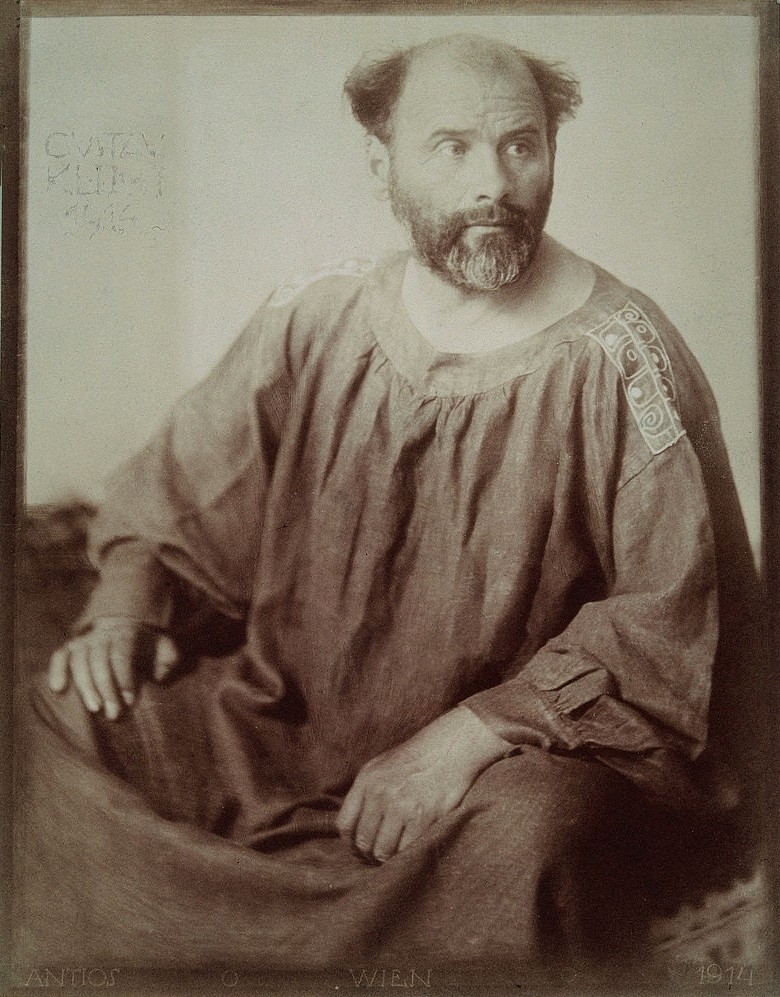
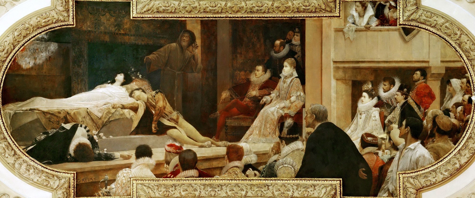
Gustave Klimt had a wide-ranging career, from his famed portraits to landscapes to allegorical and biblical subjects. Trained in the conservative tradition of European painting, Klimt had early success, receiving commissions for architectural decorations like the 1884-1887 painting of a scene from Shakespeare’s Romeo and Juliet which the artist created for the Burgtheater in Vienna. These Burgtheater paintings were so admired that he was awarded the Golden Order of Merit by the Austrian emperor. Klimt began to turn away from this old-fashioned style in the early 1890s, gradually developing a more controversial approach that alienated many of his former patrons and supporters. Fortunately, he found like-minded companions among other young artists in Vienna. Joining together, they founded the Vienna Secession, a rebellious movement rejecting the traditional style still being taught in Vienna’s art schools. The Secession presented exhibitions of avant garde art, both from its own members and from outside Austria; their exhibitions introduced Vienna to new artistic ideas including Impressionism, Symbolism, Post-Impressionism, Japanese art, Arts & Crafts, and Art Nouveau. Through his participation in the Secession, Klimt once again returned to prominence in Vienna, now among the progressive community that admired the work of this new group. As today, Klimt’s portraits were widely admired and his erotic images of nude and semi-nude women also gained an audience. At the same time, Klimt continued to create symbolic images, allegorical works that addressed themes like love, hope, life, and death.
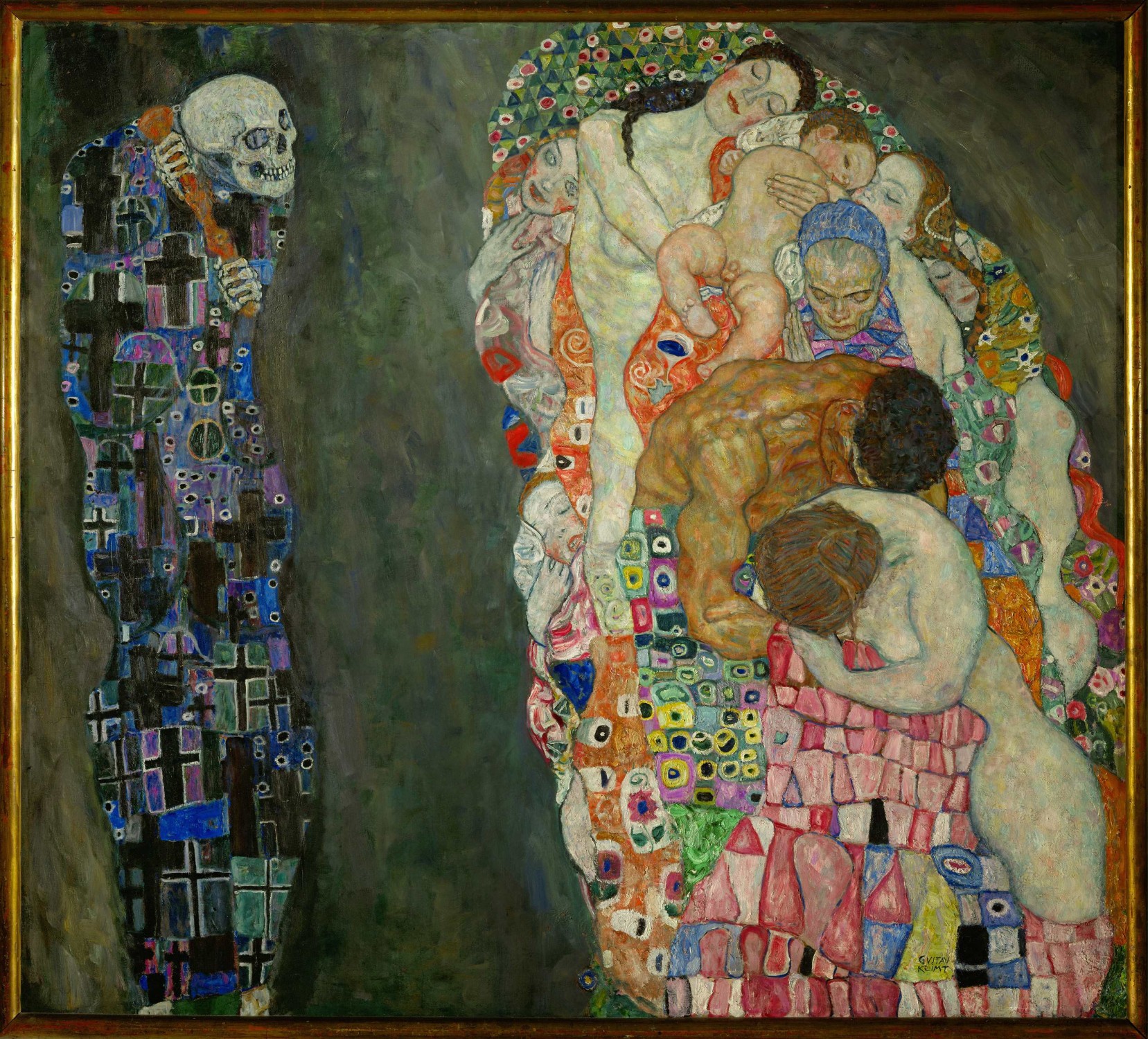
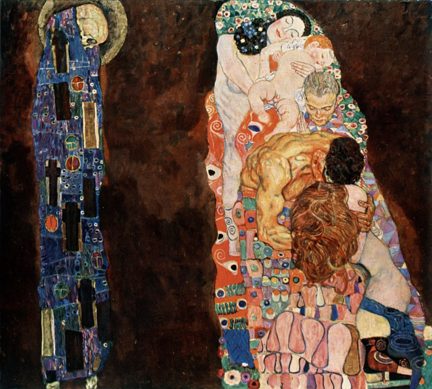
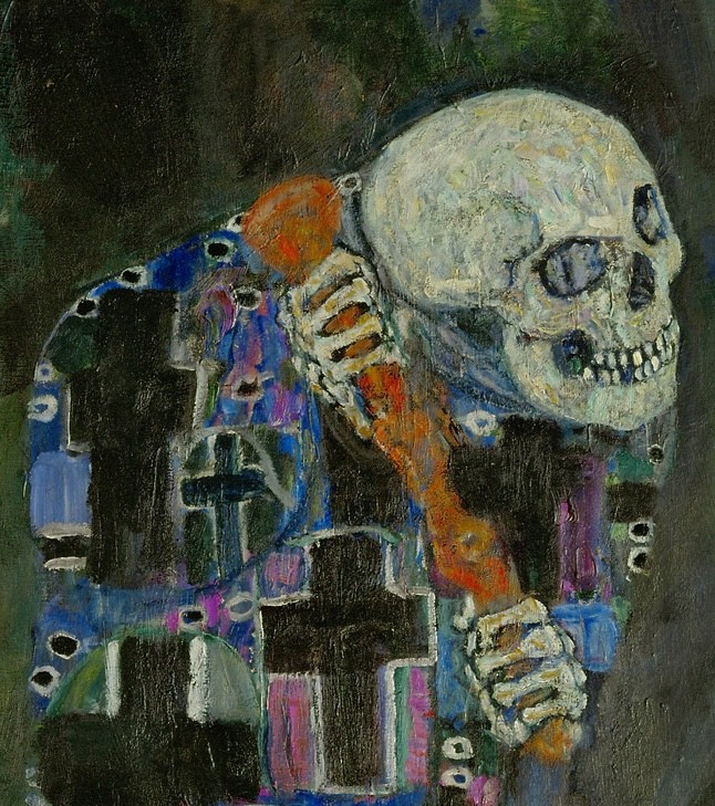
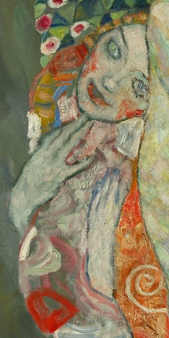
Death and Life is one of Gustav Klimt’s most powerful paintings. In this work, Klimt took on a theme that had absorbed artists for generations – the relationship between Death and Life. Instead of using a traditional Christian scene as past artists had, Klimt sought to create a modern interpretation in a modern style. The undulating curves, asymmetry, and bold colors owe much to the artist’s adoption of the Art Nouveau style (often called Sezessionstil (Secession Style) in Austria). Klimt’s determination to achieve something significant with this painting is evident in his lengthy process of creation. He began sketching the idea in 1908, and created a first version in oil paint around 1910. In that version, Death is haloed and his head is bent. The group of Life is only five figures: the mother and child at the top, the old lady in the center and the male and female couple at the bottom. Clearly dissatisfied with his first version, Klimt created the composition that survives today, beginning in 1910 and 1911, revising it in 1912 and 1913, with final revisions in 1915, and possibly even later. During all of these changes, the artist was exhibiting the painting internationally, beginning with the 1911 International Exhibition of Art in Italy where it was awarded a gold medal. The painting's original title was Fear of Death, and in 1912 it was exhibited with the title Death and Love. Klimt settled on the title Death and Life in 1913. In the final composition, the figure of Death gazes longingly, even greedily, toward the Life group. The original five figures have been joined by four more young women tucked along the sides of the group. All of the figures in the Life group are asleep, except for the young woman closest to Death. She has bright red cheeks and wide, perhaps frightened, blue eyes; she gestures toward her chest, as if to ask Death if it has come for her. This interaction increases the emotional tension of the painting far beyond that in the first version.
One thing that makes Klimt’s final composition so successful is the way that he utilized balance and contrast to convey his subject. Though the figure of Death is narrower than the group of figures opposite, the dominance of black, deep blue and violet adds visual weight that balances the bright, multicolored opposing group. Both sides of the composition have sinuous contour lines but the Life group has internal curving lines that add a greater sense of movement, reinforcing the constant change that is a hallmark of life itself.
At about 6 by 6.5 feet, Death and Life is the second largest of Klimt’s surviving paintings. The artist’s technique was remarkably slow and painstaking; the whole painting is covered with small strokes of varied color. The closer one looks, the more colors appear. This is as true of the background as it is of the figures and patterns. One of the important changes that Klimt made as he was altering the painting was to switch the background from gold to a mix of dark tones, including gray, green, and violet. This allowed the complex patterns and rich colors of the right side of the painting to stand out more clearly from the background.
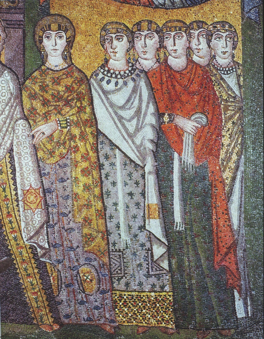
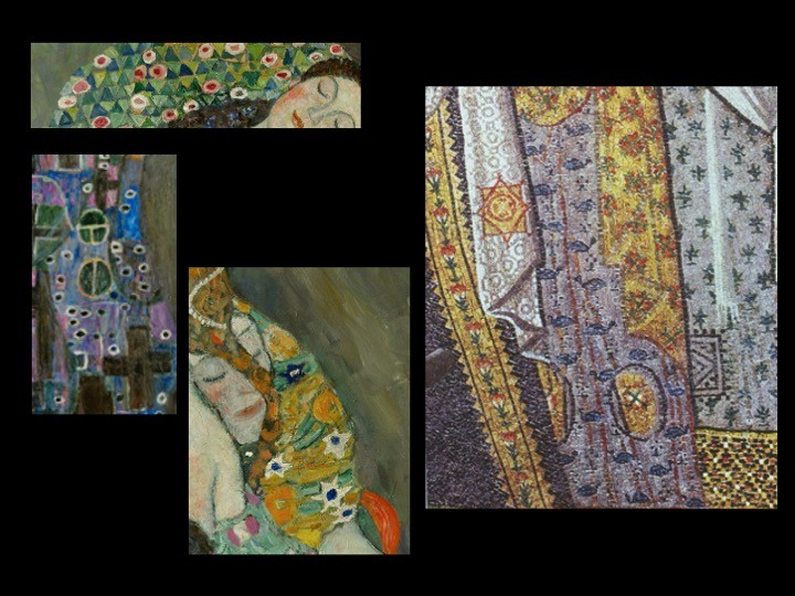
Klimt’s use of pattern was inspired by Byzantine mosaics. Created between the sixth and fourteenth centuries, mosaics were created to decorate the churches of Medieval Italy, Greece, and Turkey. Klimt visited the Italian cities of Venice and Ravenna specifically to view their mosaics and then looked for ways to incorporate their effects into his art. Though in some cases he applied actual mosaic to his works, most notably in the 1902 Beethoven Frieze, in this painting the mosaic effect was achieved with paint. In the slide show, I have included a detail of the Empress Theodora mosaic from the church of San Vitale in Ravenna to show the sixth century mosaicists' floral effects alongside the floral patterns surrounding Klimt's figures on the right. The figure of Death also has a mosaic-patterned robe, though it seems more menacing with its dark colors and pattern of crosses and circles. To me, the robe has always suggested a chaotic graveyard but others have seen it as suggesting the power of the Christian Church over both Life and Death. In common with so much Modern and Contemporary art, Klimt’s work makes room for multiple interpretations.
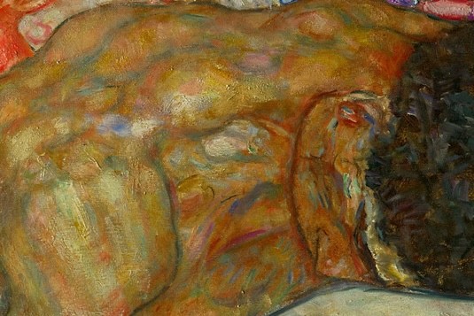
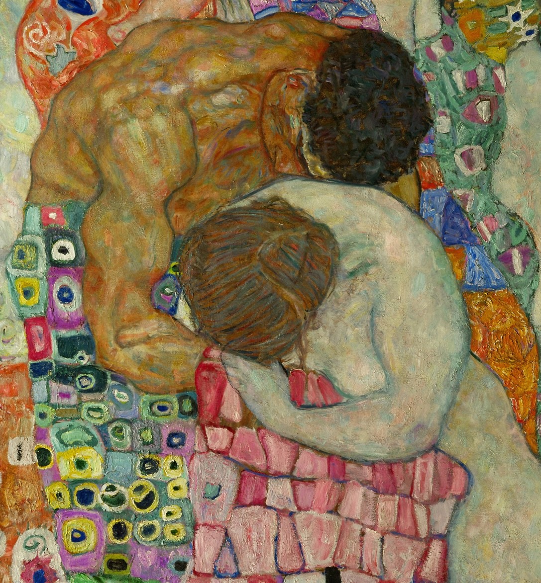
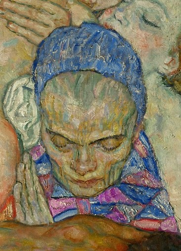
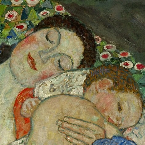
Within the Life group, the artist has included all of life’s stages. The large, darker-skinned male figure in the lower center of the group is paired with a pale-skinned woman. These two figures lean into one another and remind us of the earlier title, Death and Love under which Klimt exhibited the painting. The sleeping girls around the edges of the group, one on the left and two on the right, represent young women who are not yet awakened to love. In the center of the group is the face of an older woman; her skin is yellowish, though it also contains flecks of blue and pink seen in her clothing. Finally, at the top of the group, the sleeping mother and her infant represent the beginning of life. The mother’s face is the most fully described of all of the faces in the group. She seems filled with joy and peace as she holds her sleeping child. All of the sleeping figures seem unaware of lurking Death. Many commentators have seen this as reflecting humankind choosing to live in happy dreams, ignoring the reality of death. Scholars have also connected this emphasis on dream states to Sigmund Freud’s 1899 publication of The Interpretation of Dreams, also in Vienna.
Though Death and Life lacks the spectacular impact of Klimt’s Golden Phase paintings, it is a work which rewards close looking and thoughtful consideration. The work is a successful solution to the question of how to represent the “big ideas” that were so common in older art, but using modern forms and ideas. Thus, Death and Life can be considered a culmination of the artist’s career, incorporating as it does so many of his thematic and stylistic concerns: the symbolism of women, the importance of love, the cycle of life, the visual qualities of Art Nouveau, the beauty of mosaic, and the power of the painter to communicate all of these things.
Please share your comments and questions on Substack. LINK irequireart.substack.com/p/viewing-room-26/comments
If the caption obscures part of the artwork, click on the image to turn off the caption.
